Why Do These Symbols Look the Way They Do?
USB:-
 The USB icon was designed to resemble tri-pronged spear of the Olympian God Neptune. The pointed triangles on its tip was the best symbol to represent the power of the USB. However USB promoters decided to alter the shapes into a triangle a square and a circle to represent the diverse functionalities of the USB.
Power :-
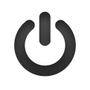 During World War II engineers used the binary system as a way to label individual power buttons & switches. Those guys gave the "on" state the number 1 and the "off" state the number 0. In 1973 the International Electromechanical Commission (ICE) coded the standby state as a broken circle with a line inside it (1 & 0). However the Institute of Electrical & Electronics Engineers (IEEE) decided that the symbol was too vague and changed it to simply refer to "power" as we know it now .
The @ : -
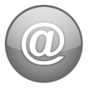 Ah the @ (at) who doesn't use it at least once a day? In chats on facebook in email addresses and so on. It's been known by many names: the snail (France & Italy ) the little mouse (China) and the the monkey's tail (Germany) among others. The @ was first introduced to the typewriter in 1885 as a shorthand symbol meaning " at the rate of ." Some suggest that @ has its origins in the sixth century when monks adopted it as better way of writing the word ad -Latin for " at " or "toward"- which wouldn't be so easily confused with AD the designation for Anno Domini.
Bluetooth :-
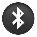 We have all of course heard the story of the 10th century Danish king Herald Bluetooth. But another fact about him is that he was a renowned blueberry fanatic! Not only that but one of his teeth was permanently stained blue! The Bluetooth symbol is actually a combination of the two runes that represent Harald's initials. It just so happens that the first Bluetooth receptor also had a "teeth-like" shape and guess what? It was Blue!
FireWire :-
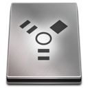 In 1995 a small group at Apple (the main developer of FireWire (a form of connectivity similar to USB)) designed a symbol that would symbolize the new technology they were working on a speedy connection for audio and video. The designers came up with a symbol with three spikes one representing video one audio and one data. The symbol was first designed with the color red but was later altered to yellow for unknown reasons (as usual from Apple).